The success of any trade (including crypto) depends to a large extent on the analysis that you conduct. This is the cornerstone of getting results consistently, not based on luck. Crypto beginners will find the information in this article useful.
The key tools that traders use in analysis are, of course, various charts and charts, which for the most part represent the dynamics of parameters determined by both price and volume.
Cryptocurrency beginners
In this article, we want to cover the most common cryptocurrency charts that you will see on exchanges and tools that cryptocurrencies use in their work.
Linear price chart
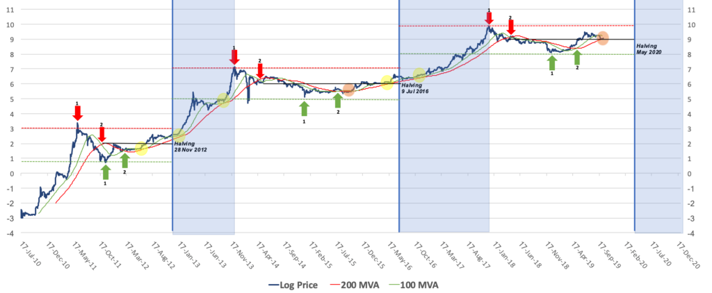
The most basic price chart is the line chart. This type of chart is used to get an idea of the crypto price changes over a certain period of time, represented by a line. The price chart is based on the cryptocurrency closing price of the day. Line charts can also have two scales: linear and logarithmic. On a line chart, the price scale is divided into equal parts.
On a log chart, the crypto price is scaled according to the percentage change, so if two price changes differ in absolute value but equal in percentage, they will both be represented by the same vertical shift in a log scale. With a line chart, you can better judge the rate of price change, whereas log charts are more obvious in terms of how traders see trend and cryptocurrencies.
Line Chart (Bitcoin Price)
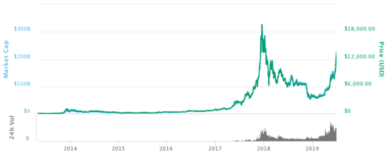
Logarithmic chart (bitcoin price)
You can often also see the volume indicator displayed at the bottom of the cryptocurrency chart. Volume shows the number of coins that have been sold over a given period. Volume is considered the most fundamental indicator of crypto price direction and also helps to understand where the price will go.
For example, if the price of a coin increases with the maximum volume, it means that many traders in the crypto market have started making moves. In this case, the price is likely to continue to rise. When volume is low and price is declining, then not many people buy or sell cryptocurrency. Good to know for cryptocurrency beginners.
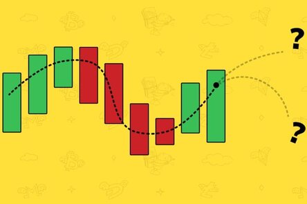
Candlestick chart
A candlestick chart is another way to represent crypto price movements. It contains more information, since it shows not only the price change based on the closing price of the market, but also its movement over a certain period of time: each candle shows what was the highest and lowest price, what was the opening and closing prices. This is why this type of charting has gained popularity among crypto traders around the world and is preferred over line charts.
Let’s see how the cryptographic candlestick chart is plotted. Each candle has three parts: the upper tail, the lower tail, and the body. The top tail shows the highest price and the bottom tail shows the lowest price. However, sometimes there are no top or bottom tails because the open / close price of a cryptocurrency is almost equal to the price of the lowest or highest level.
The body is usually colored green or red. The color depends on whether the trend was “bullish” or “bearish”, ie. whether the closing price was higher than the opening price (green, bullish) or lower (red, bearish) at a specific time frame during the selected time.
platform provides users with six time options ranging from a minimum of 6 hours to a maximum of 1 week.
Various candlestick shapes and their combinations give crypto traders information about trends and their changes. There are over 10 types of candlestick patterns, but in this article we will try to cover the most common ones.
The first pattern is the hammer candlestick, which is a bullish pattern. It is a short body with a lower tail, Dogecoin price now days going very up as can be seen at the bottom of a downtrend. Reverse hammer also refers to bullish patterns, and this implies that buyers control the cryptocurrency.
The most common bearish candlestick patterns are the Hanging Man and Shooting Star. The Hanging Man has the same shape as the hammer, but can be found at the end of an uptrend. This means that buyers have again managed to raise the price of the cryptocurrency.
How to read charts when trading cryptocurrencies
A shooting star has the same shape as a reverse hammer, but forms in an uptrend. A shooting star pattern can indicate that the uptrend has ended and the time for the downtrend has come.
When there is no change in the cryptocurrency market, you can see the so-called continuation candlestick patterns. Dojis are formed when the opening and closing prices of the market are equal, and its shape is similar to a cross, but with a large body.
As you become familiar with these basic patterns, you will begin to pay attention to their combinations, such as two or three candlestick patterns, which will help you predict the future direction of the coin’s price.
Moreover, when you start looking at charts on crypto exchanges, you can also see several colored lines: these lines are known as moving average indicators, they are based on the average price of the coin based on its value over the past periods.
These lines are known as moving average indicators and are based on the average price of a coin based on its value over the past period of time. Typically, exchanges show 3 moving averages: based on the closing prices of the previous 7, 25 and 99 days. This indicator is one of the tools for identifying trends and signals for entering and exiting a position. Crypto beginners – how to read charts when trading cryptocurrencies
Market Depth Chart
It gives an idea of the supply and demand situation in the cryptocurrency market. You can easily define sell (red) and buy (green) orders. The green side shows the total number of coins with buy orders at the current price, and the red side shows the number of cryptocurrencies with sell orders at the current price.
The centre where the two lines meet each other represents the current Bitcoin price. If you place your cursor anywhere on the green or red line, you will see exactly how much you can buy or sell (vertical axis) at a specific price (horizontal axis).
Outcome
Reading charts for cryptocurrency newbies is an essential skill that every trader must acquire. We hope that the basic diagrams and explanations described in this article will help you get an idea of crypto exchanges and understand that reading the diagrams is not as difficult as it might seem at first glance.


